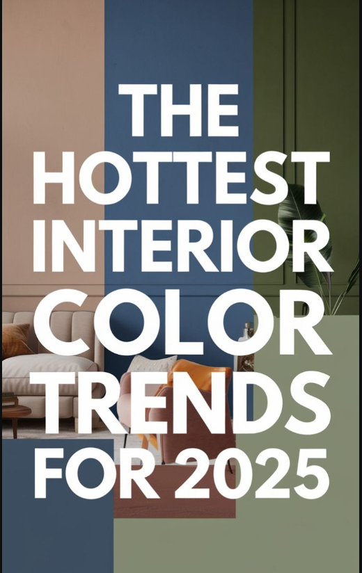
Choosing a color palette isn’t just about following trends – it’s about creating a space you’ll love for years. In home design, timeless color palettes help a room feel both elegant and welcoming. As one designer reminds us, “the colors you use will set the mood for how a space will feel”, so picking classic shades is worth the effort. Whether you love modern minimalism or a cozy farmhouse vibe, a well-chosen neutral or accent combo can serve as a beautiful, durable backdrop. Let’s explore 10 color pairings (each with a fun name!) that never go out of style.
1.Warm Wood & Navy Blue:
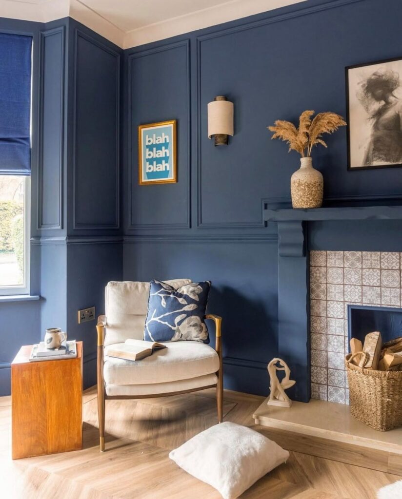
This grounding palette blends rich walnut wood with a deep navy accent. It feels cozy and earthy, like a peaceful tea-room scene, while the navy adds depth and a touch of elegance. Navy is a classic color that brings a rich, timeless feel to any space, balancing the wood’s warmth. This combination never feels dated. Best for: living rooms, reading nooks, or dining areas in modern rustic or Scandinavian-style homes.
2.Cream & Warm Taupe:
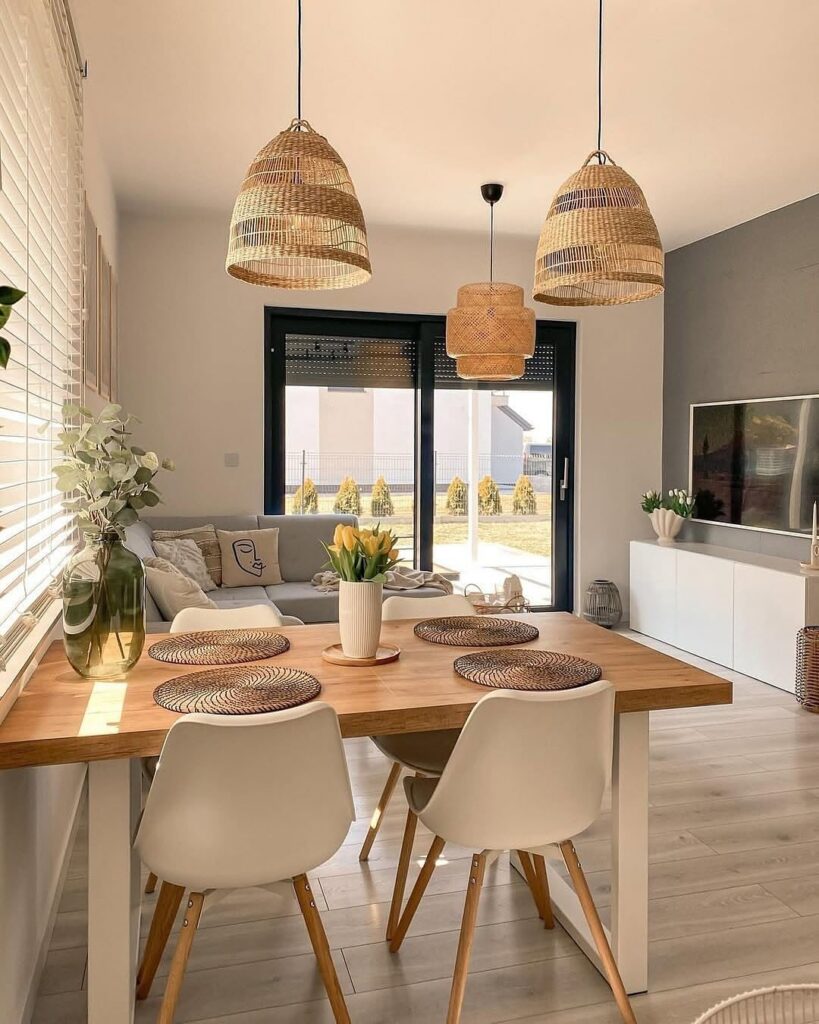
Creamy off-white paired with soft taupe is as welcoming as it sounds. These neutrals create a light, airy backdrop that feels both serene and sophisticated. Beige is a classic neutral that works in any room, and taupe adds a warm, versatile layer. Best for: just about any room – especially living rooms and bedrooms in modern, farmhouse, or transitional styles.via @nagaw.home
3.Ocean Blue & Crisp White:
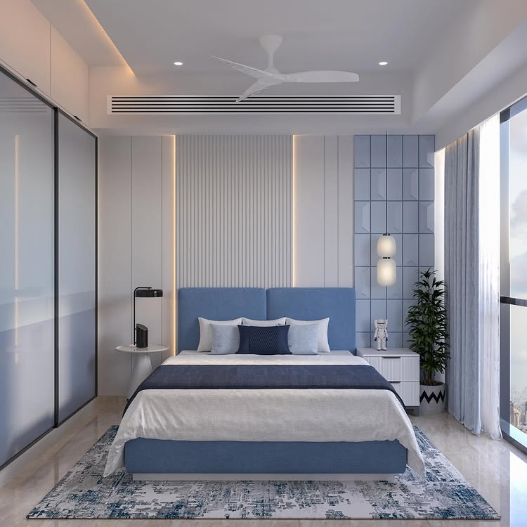
This classic coastal combo feels fresh and serene. The blue brings a calming, spacious vibe and the white keeps things bright – it’s no surprise that designers call blue a “time-honored favorite” for its soothing effect. Best for: bathrooms, bedrooms, or any sunlit living area (perfect in nautical, cottage, or coastal-inspired decor). @tanujaandassociates
4.Sage Green & Natural Linen:
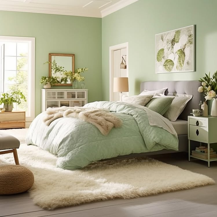
Soft sage green paired with warm beige or linen tones evokes nature indoors. It creates a peaceful, grounded mood – green is known to be a naturally calming color, and light linen hues keep the look fresh. Best for: bedrooms, living rooms, or home offices in bohemian, farmhouse, or organic-modern styles.
5.Charcoal Gray & Blush Pink:
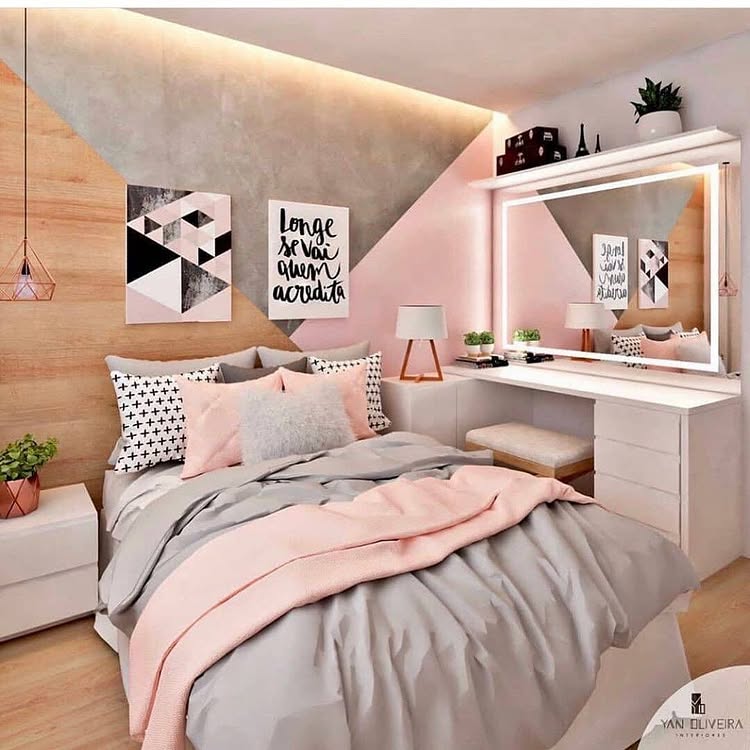
This refined palette mixes a moody charcoal gray with a soft pink blush. The gray base feels sophisticated and modern (gray is famously a “timeless” neutral), while the blush adds warmth and a gentle glow. Best for: bedrooms, nurseries, or living rooms in contemporary, glam, or transitional settings.@homeandesigns
6.Black & White:
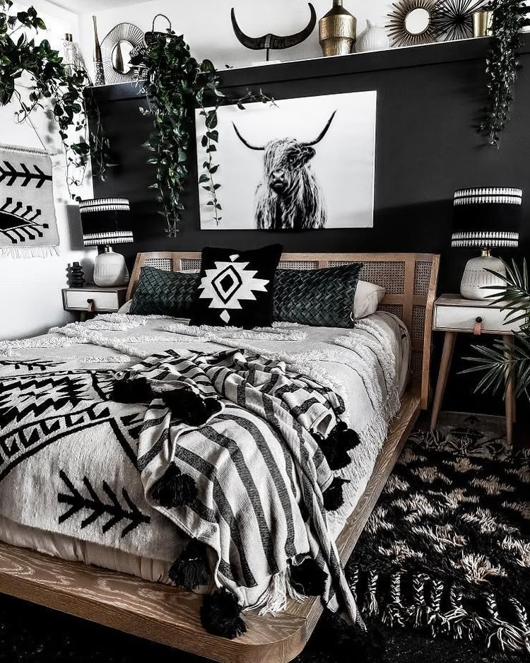
A high-contrast pairing that always feels crisp and chic. Black and white feels bold and graphic – black adds drama and sophistication even in small doses – while any accent color will pop against them. Best for: kitchens, bathrooms, or living areas in modern, minimalist, or art-deco-inspired styles.mumo_toronto
7.Forest Green & Sandstone:
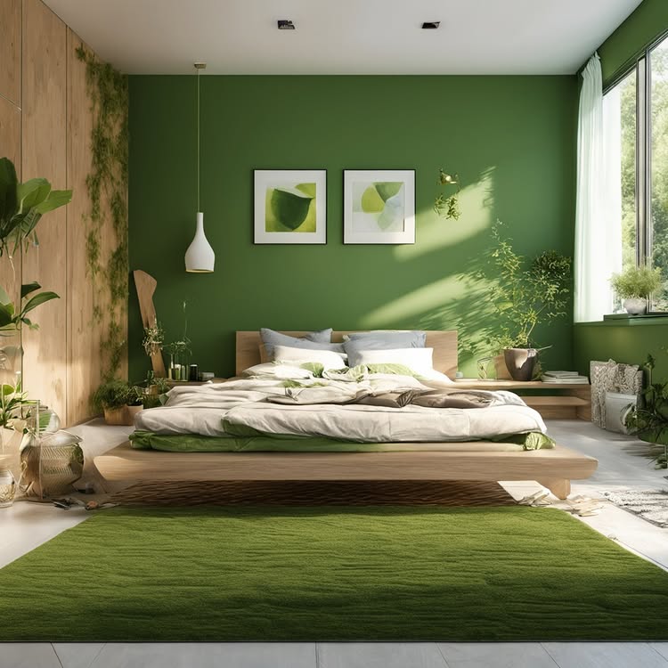
Think rich forest green with a warm tan/beige (sandstone) accent. This earthy scheme feels cozy and elegant – in fact, designers note that “deep olive green” paired with brown and tan makes for a bold yet balanced aesthetic. Best for: home offices, libraries, or living rooms in traditional, rustic, or nature-inspired interiors.
8.Soft Gray & Sunny Yellow:
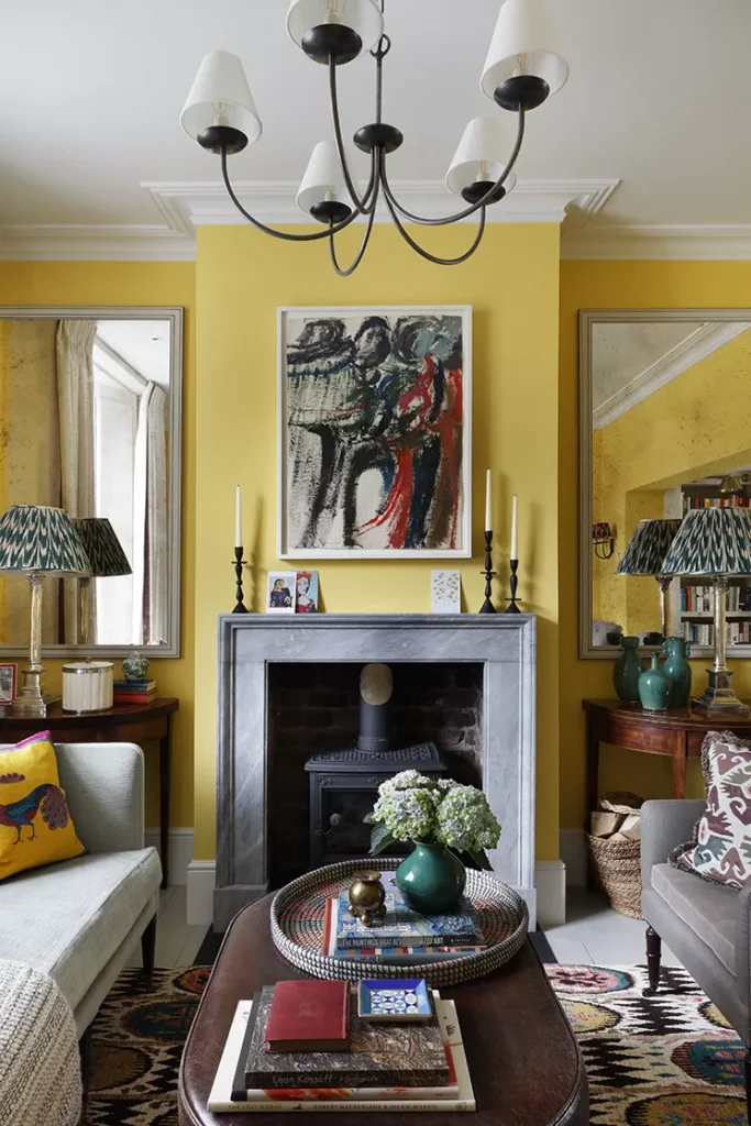
Light gray with pops of golden yellow is modern yet cheerful. The gray keeps the look sophisticated and fresh, while mustard or sunshine yellow brings a dash of warmth and optimism. Best for: kitchens, living rooms, or even a playful kids’ room – especially in Scandinavian, mid-century, or contemporary styles. @Studio Peake
9.Emerald Green & Cream:
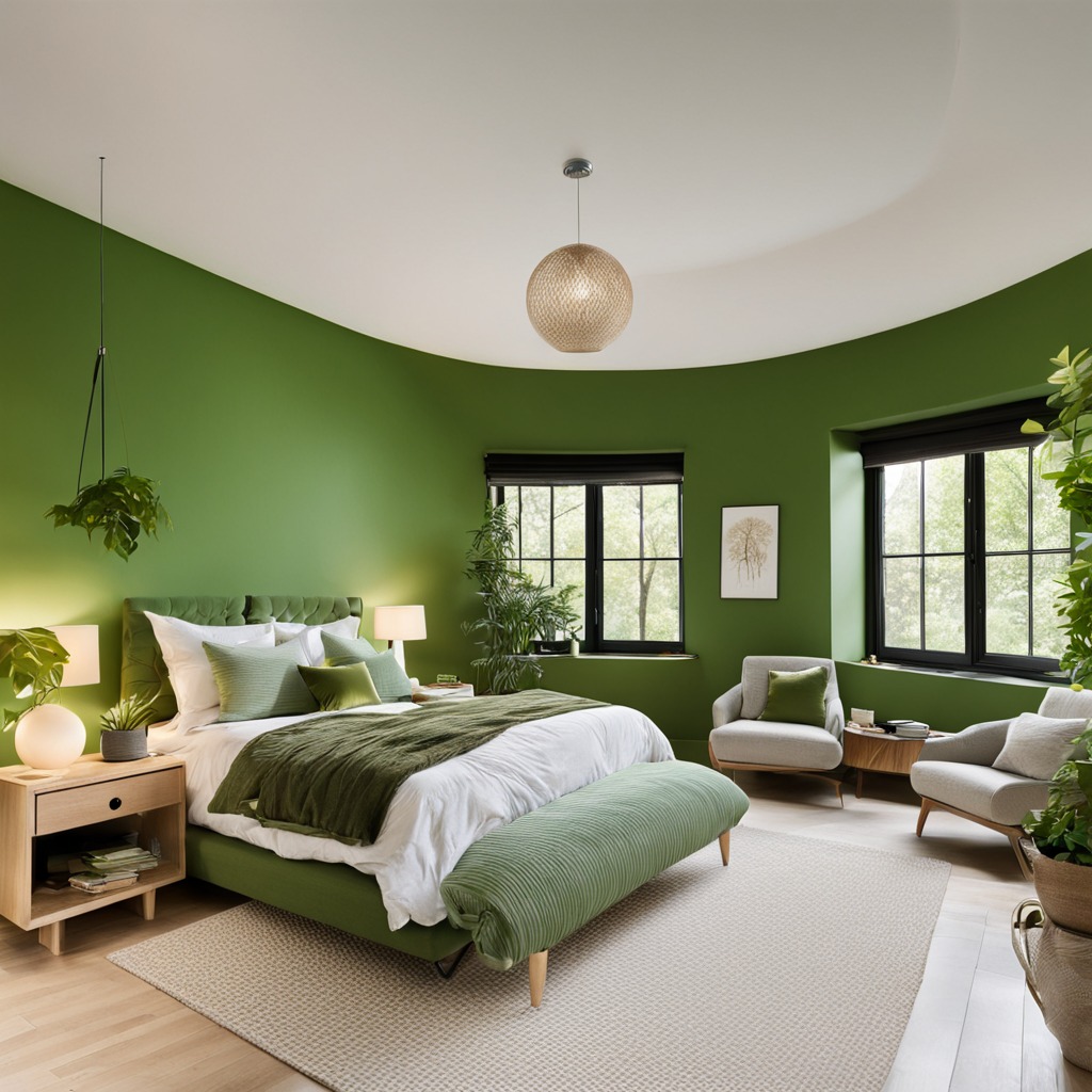
A deep, jewel-toned green with creamy off-white feels luxurious and restful. Emerald adds a rich, cozy vibe (green is famous for its calming, natural feel) and the cream brightens the space. Best for: formal living rooms, dining rooms, or bedrooms in classic, eclectic, or luxe-traditional styles. @bedroom.decor_
10.Lavender & Soft Gray:
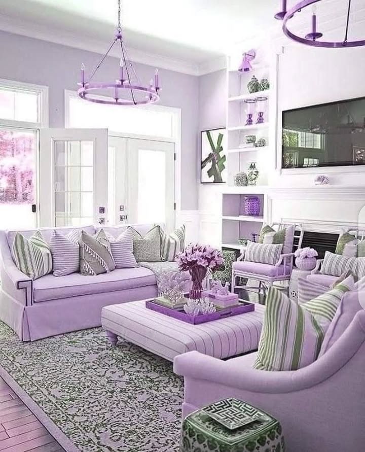
This dreamy mix of pale lavender and light gray feels serene and romantic. It has a gentle, restful quality – designers even note that soft pastels like dusty lavender and pale blue are “timeless…for a reason”. Best for: bedrooms, nurseries, or bathrooms in shabby-chic, vintage, or soft-modern interiors.
Conclusion: At the end of the day, the best rule for using timeless color palettes is to follow your instincts. Have fun playing with paint swatches or accent pillows until something clicks. Whether you stick to one of these classic combos or tweak them with your own twist, trust that your taste will guide you. With a solid, time-tested palette as your starting point, you’ll create a space that feels elegantly you for years to come.

